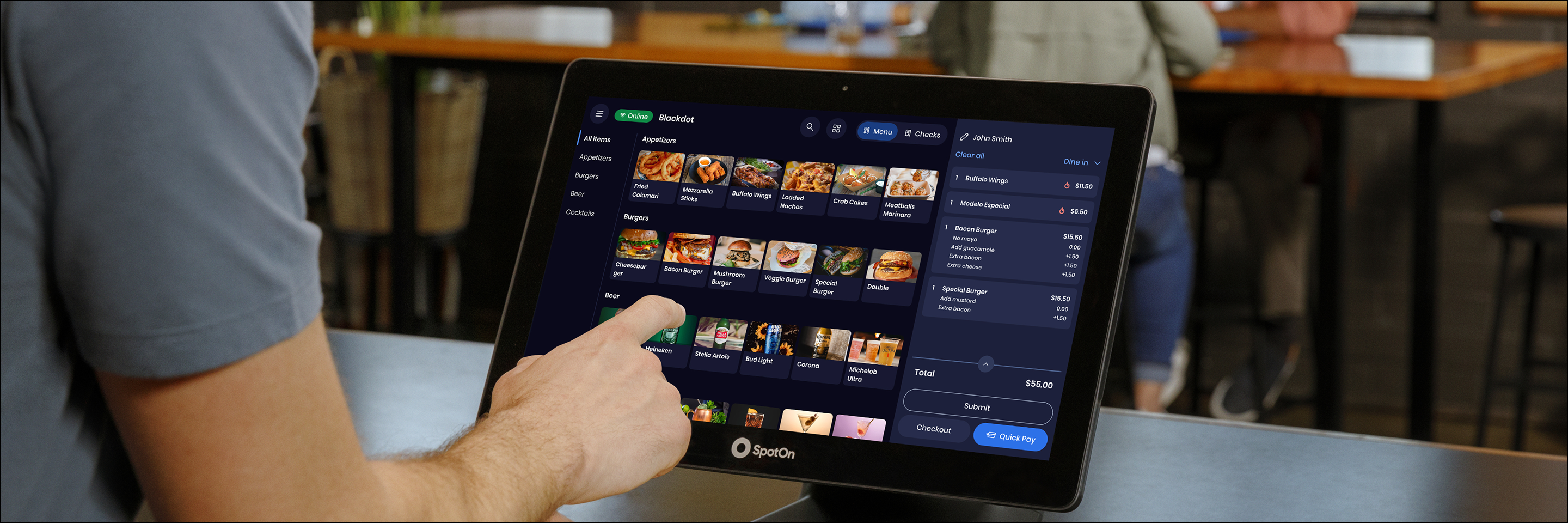
Shortly after I joined SpotOn, the company made a strategic shift to accelerate Express, its more nimble POS designed for smaller bars and restaurants. I led design across the Hospitality and Guest domains through that transition , aligning a fragmented org, making hard tradeoffs, and shipping work that expanded what Express could sell and who it could serve.
Gross Payment Volume Growth
More Checks Visible on Screen
Products Across Hospitality and Guest
Express Platform Scale
Customer Satisfaction Trending
The Situation
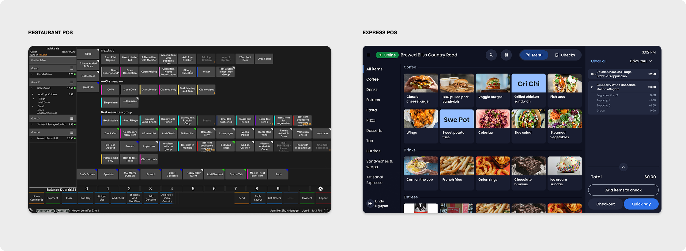
SpotOn acquired a legacy POS system and decided to accelerate it into Express, a product built for smaller, faster-moving restaurant and bar accounts. We were simultaneously maintaining RPOS, the existing platform for our highest-value full-service merchants, while standing up something meaningfully different alongside it.
The hardest part was not the technology. It was the alignment. Product, Engineering, and Design were organized differently from each other. Leadership was not fully aligned on priorities. Engineering was working in tiger teams, which meant every design investment needed to be intentional. We had a globally distributed design team across the US, Mexico, and Poland, with limited overlap and real collaboration constraints.
On top of that, we were under constant pressure to match Toast feature for feature. Toast was the largest player in the market and the benchmark our sales team faced in the field constantly. That pressure shaped what the roadmap asked for, and it often asked for speed over depth.
My Role
I owned the Hospitality and Guest domains: seven products, one manager, seven designers, and horizontal partners in Content, Research, and Design System. My partners on the product side were a VP of Product, two Group PMs overseeing eight PM ICs, and seven engineering managers across the organization.
In practice, my focus was on creating the operational infrastructure that did not exist. I built out team Jira, established timelines, sized asks, translated scope into workable assignments for my ICs, and ran daily or weekly design critiques depending on where the work was. I aligned PMs on outcomes when the roadmap was unclear. I escalated blockers with Engineering and Product leadership when the team needed air cover. And I tested prototypes in actual restaurants, not just in reviews.
Design had limited influence over roadmap priorities, but we shaped the experience, held the standard of the design system, and pushed for market differentiation where we could make the argument.
Key Decisions and Tradeoffs
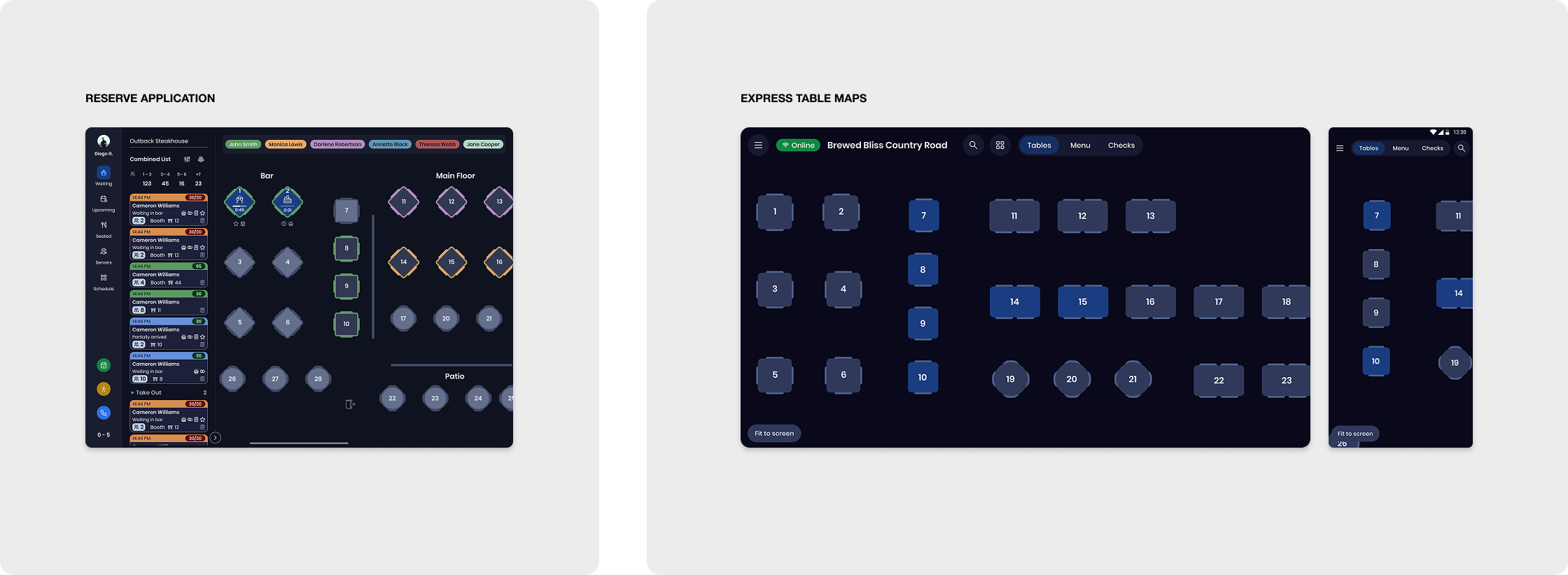
Table Maps: Alignment over speed
Table maps were a critical feature for Express to compete in table service restaurants. The tempting path was to build something lightweight and Express-specific quickly. We did not do that.
Express shares a web-based table map editor with Reserve, SpotOn's reservation product. Even though Reserve has since moved to an app, that editor remains shared. The table map experience on the POS lives in our Android codebase, on both the terminal and the handheld, but the editor that powers it is web-based and used across both products. We needed to honor that.
My decision was to stay aligned with Reserve's design decisions and patterns until we had a clear and defensible reason to break away. We built the Android experience informed by Reserve's visual language and interaction model, which meant more coordination upfront but protected us from creating divergent experiences that would be expensive to reconcile later. Long-term convergence over short-term speed.
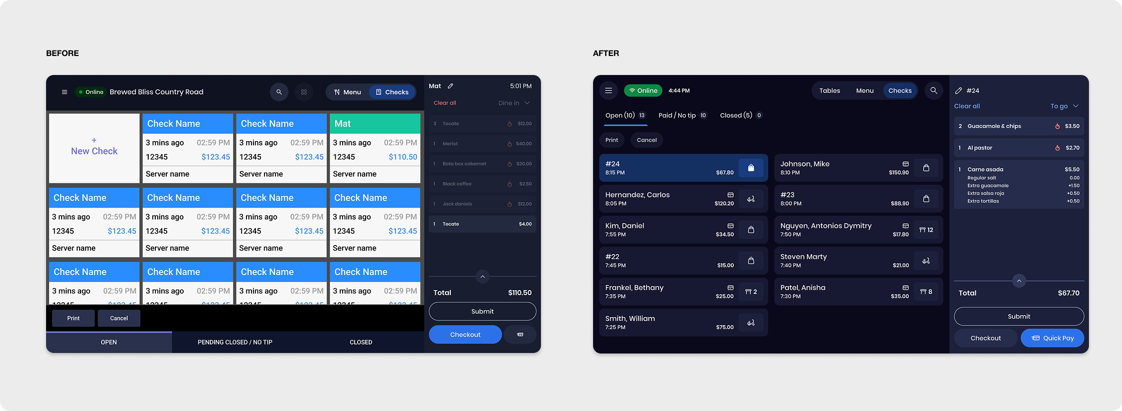
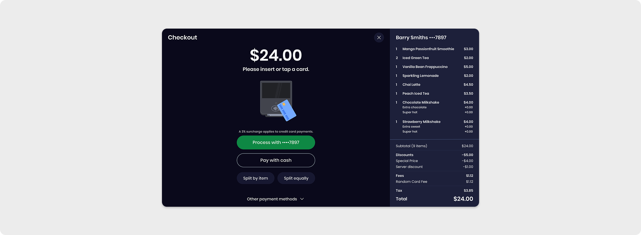
Checks Redesign: Research-driven friction reduction
The Checks page was one of the highest-frequency surfaces in the product. Servers live on it during service. But it was built on an old codebase with a design that had not kept pace with how the product had grown. It was cluttered, slow to scan, and even slower on the smaller handheld screen.
We ran research, iterated heavily, and pushed the team to make hard editing decisions. We cut nonessential information, standardized how real-world data was displayed, and reorganized the layout so the most important actions were reachable immediately.
The result: we could fit 40 percent more checks on screen at once, and the experience was dramatically faster on the handheld, where screen real estate is the binding constraint.
Unified Payflow: One entry point, less room for error
Payment flows had grown organically across the product, which meant servers encountered multiple entry points for what was functionally the same action. In high-pressure moments during service, that fragmentation caused confusion and errors.
We eliminated the redundant entry points and unified payment behind a single CTA. We prioritized the most common flows and removed the decision points that were creating friction without adding value. Fewer paths, fewer mistakes, faster close times.
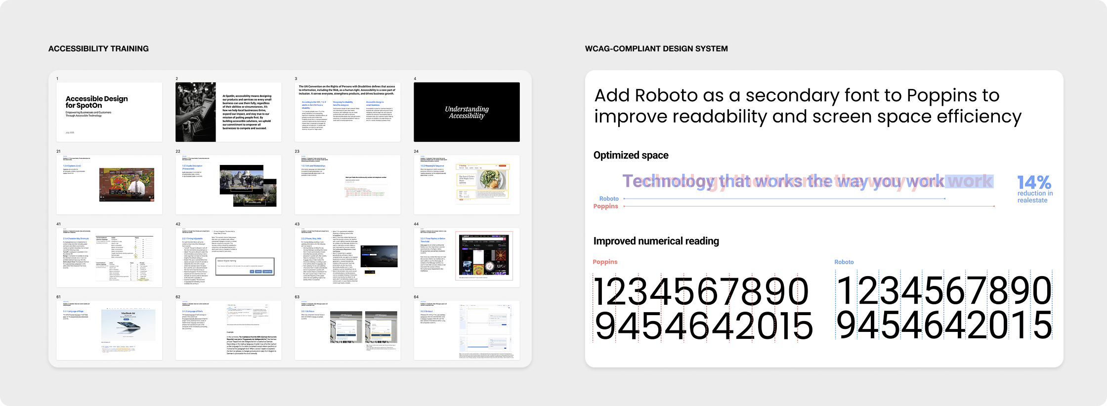
Design System and Accessibility
Alongside the product work, my team contributed significantly to the design system that supported the entire design organization, including my scope across Hospitality and Guest. We worked with Marketing to align colors across products and the dashboard, standardized design tokens and components, and added Roboto as a secondary typeface alongside Poppins to improve readability and screen space efficiency on smaller displays.
A significant body of work went into accessibility. We applied WCAG-aligned colors to both light and dark modes, ensuring each mode was independently accessible rather than just compliant in one direction. We defined clearly scoped use cases for the full brand palette: core, semantic, and marketing roles.
I championed accessibility beyond the design system work as well. I built and delivered WCAG 2.2 accessibility training for the full Product Design team, covering all 13 guidelines and the POUR framework. I earned my W3C accreditation in the process and secured budget to get my team access to the same certification.
Outcomes
Express grew from alpha to fully GA during this period and continues to grow at an aggressive pace. We rolled out handhelds successfully, which opened the door to table service accounts that were previously out of reach. The platform now supports more complex merchant setups including multi-location operators and full table service restaurants.
CSAT scores trended up. Customer support volume trended down. GPV grew 76.5 percent. More merchants. More complexity handled. More of the market within reach.
The design team built processes, rituals, and standards that did not exist when I arrived. The design system is more consistent. The org has a clearer understanding of how design and product work together. That infrastructure will outlast any single feature.